Several months have passed since I completed the 36 Days of Type challenge, and today I took a look back at my work. It’s interesting to see the stylistic and thematic choices I made, while remembering the frantic rush of trying to create something every day.
From a quality perspective, there are a few letters that turned out quite well (if I do say so myself). Below are my two absolute favorites:
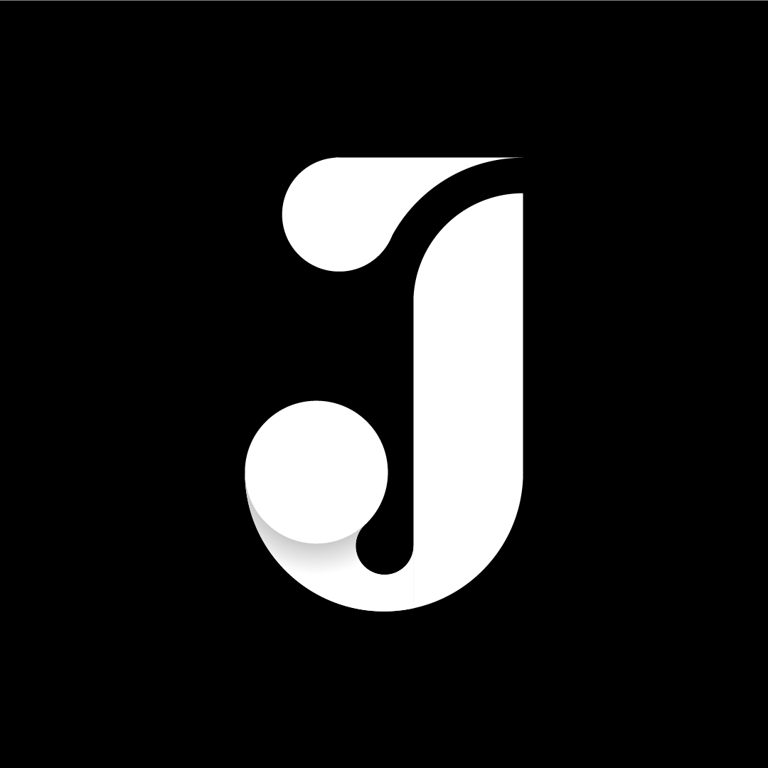

The two letters are similar, expressing a sophistication through the deliberate curves and emphasized terminals, and displaying confidence with their wide, chunky stems. Limiting the palette to just black and white helps create this stylish feeling, similar to a high-end fashion brand or retailer.
Some of my other letters however, were not as successful. In fact there are a few that I am ashamed to have ever shown to the public! But ultimately this was a challenge to myself, to see if I could make time to produce something that was solely for me, every single day. And from that perspective, it was a success, even if the results were not always aesthetically pleasing.
As a professional in the creative industry, it’s often challenging to find time for personal projects. But in my opinion, finding that time is essential to sustained success. Being able to let your creative juices flow, without restraints or deadlines or quantifiable goals, keeps your mind fresh and your sanity intact. This will raise the quality of the work you output, and increase your efficiency. Sounds like a win-win to me.